马上过年啦,想想我的网站也不能落下啊。挂点儿灯笼吧。
顺便水篇文章(不是)
挺好康的
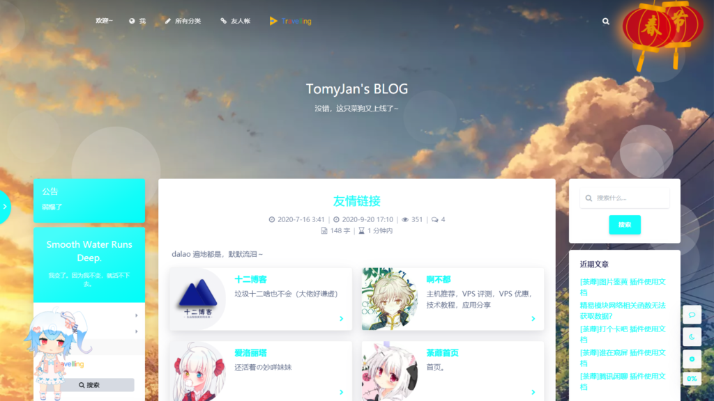
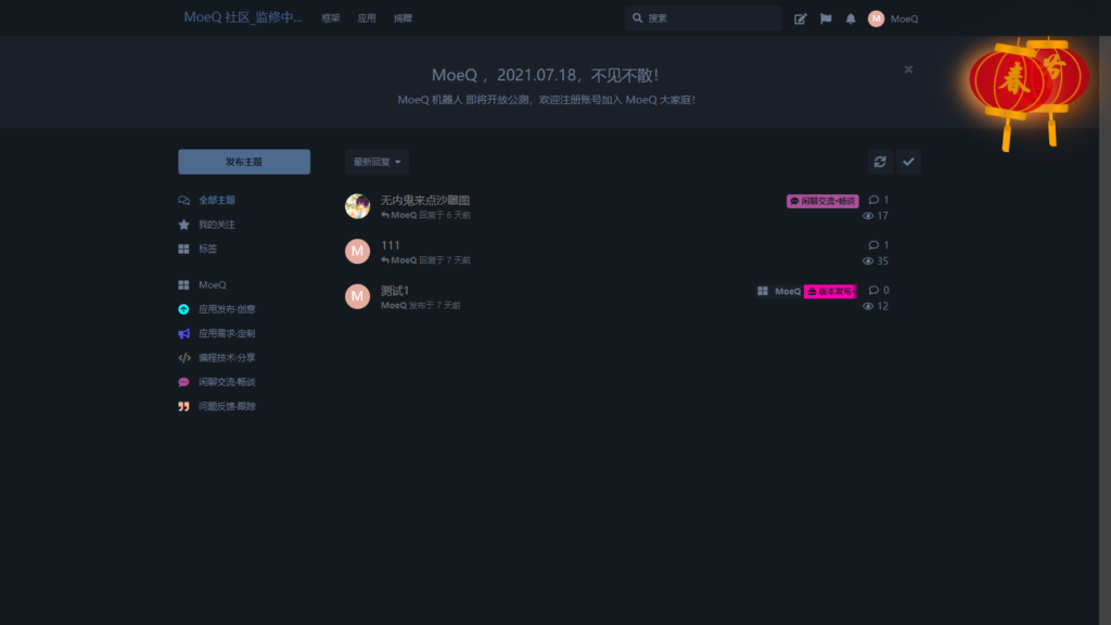
PC网页
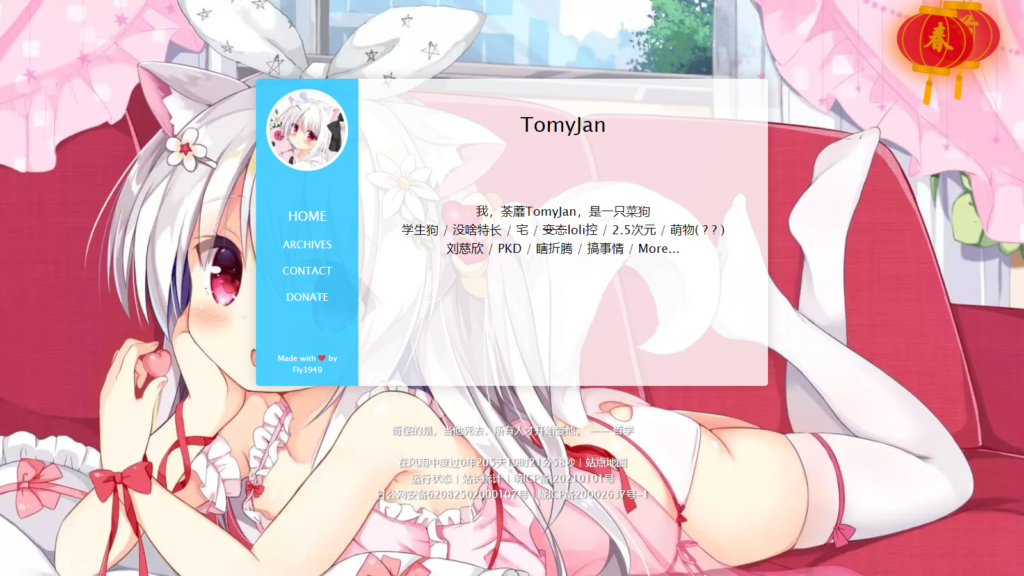
移动端
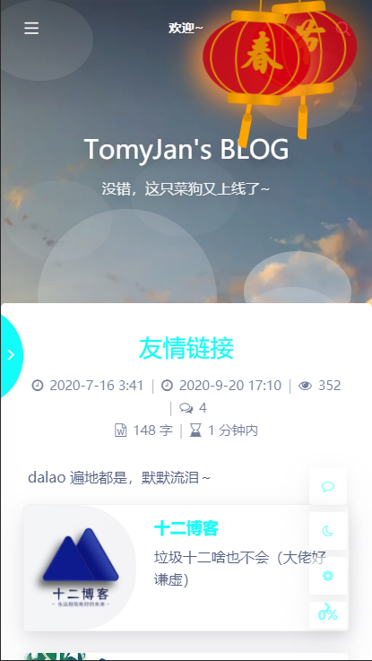
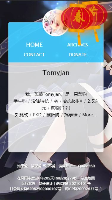
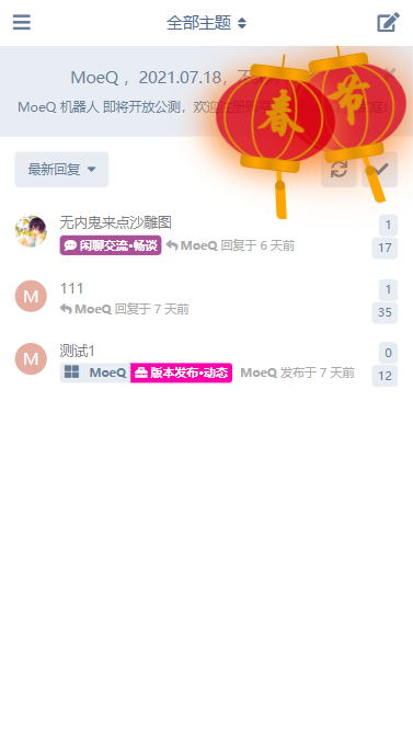
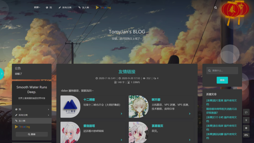
在深色背景上莫名好康…
代码丢这里
<!-- 灯笼1 -->
<div class="deng-box">
	<div class="deng">
		<div class="xian"></div>
		<div class="deng-a">
			<div class="deng-b"><div class="deng-t">节</div></div>
		</div>
		<div class="shui shui-a"><div class="shui-c"></div><div class="shui-b"></div></div>
	</div>
</div>

<!-- 灯笼2 -->
<div class="deng-box1">
	<div class="deng">
		<div class="xian"></div>
		<div class="deng-a">
			<div class="deng-b"><div class="deng-t">春</div></div>
		</div>
		<div class="shui shui-a"><div class="shui-c"></div><div class="shui-b"></div></div>
	</div>
</div>


<style type="text/css">
.deng-box {
	position: fixed;
	top: -40px;
	right: -20px;
	z-index: 999;
}

.deng-box1 {
	position: fixed;
	top: -30px;
	right: 10px;
	z-index: 999;
}

.deng-box1 .deng {
	position: relative;
	width: 120px;
	height: 90px;
	margin: 50px;
	background: #d8000f;
	background: rgba(216, 0, 15, 0.8);
	border-radius: 50% 50%;
	transform-origin: 50% -100px;
	-webkit-transform-origin: 50% -100px;
	animation: swing 5s infinite ease-in-out;
	-webkit-animation: swing 5s infinite ease-in-out;
	box-shadow: -5px 5px 30px 4px rgba(252, 144, 61, 1);
}

.deng {
	position: relative;
	width: 120px;
	height: 90px;
	margin: 50px;
	background: #d8000f;
	background: rgba(216, 0, 15, 0.8);
	border-radius: 50% 50%;
	transform-origin: 50% -100px;
	-webkit-transform-origin: 50% -100px;
	animation: swing 3s infinite ease-in-out;
	-webkit-animation: swing 3s infinite ease-in-out;
	box-shadow: -5px 5px 50px 4px rgba(250, 108, 0, 1);
}

.deng-a {
	width: 100px;
	height: 90px;
	background: #d8000f;
	background: rgba(216, 0, 15, 0.1);
	margin: 12px 8px 8px 8px;
	border-radius: 50% 50%;
	border: 2px solid #dc8f03;
}

.deng-b {
	width: 45px;
	height: 90px;
	background: #d8000f;
	background: rgba(216, 0, 15, 0.1);
	margin: -4px 8px 8px 26px;
	border-radius: 50% 50%;
	border: 2px solid #dc8f03;
}

.xian {
	position: absolute;
	top: -20px;
	left: 60px;
	width: 2px;
	height: 20px;
	background: #dc8f03;
}

.shui-a {
	position: relative;
	width: 5px;
	height: 20px;
	margin: -5px 0 0 59px;
	animation: swing 4s infinite ease-in-out;
	-webkit-animation: swing 4s infinite ease-in-out;
	transform-origin: 50% -45px;
	-webkit-transform-origin: 50% -45px;
	background: #ffa500;
	border-radius: 0 0 5px 5px;
}

.shui-b {
	position: absolute;
	top: 14px;
	left: -2px;
	width: 10px;
	height: 10px;
	background: #dc8f03;
	border-radius: 50%;
}

.shui-c {
	position: absolute;
	top: 18px;
	left: -2px;
	width: 10px;
	height: 35px;
	background: #ffa500;
	border-radius: 0 0 0 5px;
}

.deng:before {
	position: absolute;
	top: -7px;
	left: 29px;
	height: 12px;
	width: 60px;
	content: " ";
	display: block;
	z-index: 999;
	border-radius: 5px 5px 0 0;
	border: solid 1px #dc8f03;
	background: #ffa500;
	background: linear-gradient(to right, #dc8f03, #ffa500, #dc8f03, #ffa500, #dc8f03);
}

.deng:after {
	position: absolute;
	bottom: -7px;
	left: 10px;
	height: 12px;
	width: 60px;
	content: " ";
	display: block;
	margin-left: 20px;
	border-radius: 0 0 5px 5px;
	border: solid 1px #dc8f03;
	background: #ffa500;
	background: linear-gradient(to right, #dc8f03, #ffa500, #dc8f03, #ffa500, #dc8f03);
}

.deng-t {
	font-family: 华文行楷,Arial,Lucida Grande,Tahoma,sans-serif;
	font-size: 3.2rem;
	color: #dc8f03;
	font-weight: bold;
	line-height: 85px;
	text-align: center;
}

.night .deng-t,
.night .deng-box,
.night .deng-box1 {
	background: transparent !important;
}

@-moz-keyframes swing {
	0% {
		-moz-transform: rotate(-10deg)
	}

	50% {
		-moz-transform: rotate(10deg)
	}

	100% {
		-moz-transform: rotate(-10deg)
	}
}

@-webkit-keyframes swing {
	0% {
		-webkit-transform: rotate(-10deg)
	}

	50% {
		-webkit-transform: rotate(10deg)
	}

	100% {
		-webkit-transform: rotate(-10deg)
	}
}
</style>
随便插到网页源码任何地方就好啦~
效果不满意的话可以自己更改
强迫症我当然允许你把CSS和HTML分开。
新年快乐~~

这个灯笼可以 哈哈!过年时挂一挂(~ ̄▽ ̄)~
我的破站上电视了

诶嘿
感谢大
姥姥的代码(/ω\)大佬好!
可以想小栗子一样分开,而且两边都有吗?不会啊,大佬求白嫖(划掉)教?
直接复制灯笼的div,然后复制修改相应的css就可以了啊